Welcome!
Before continuing the story begun in my first post, I’d like to share an article,
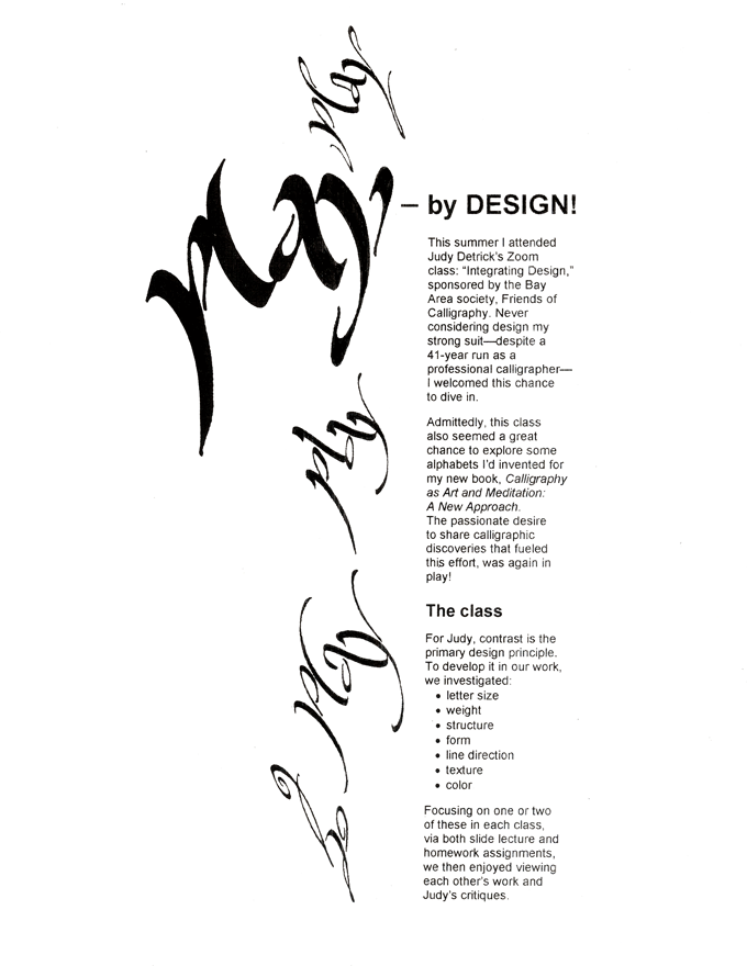
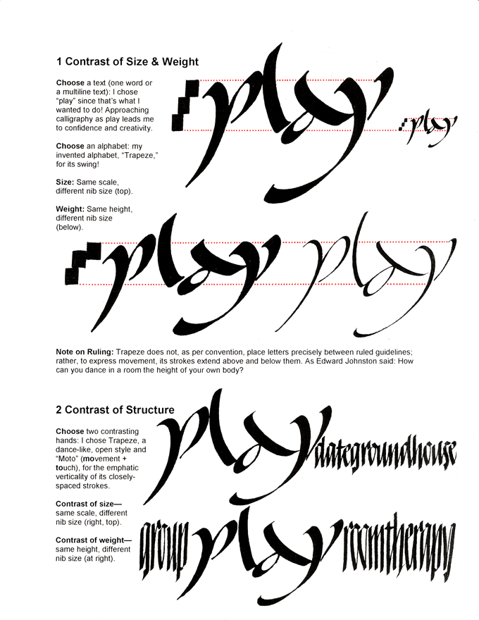
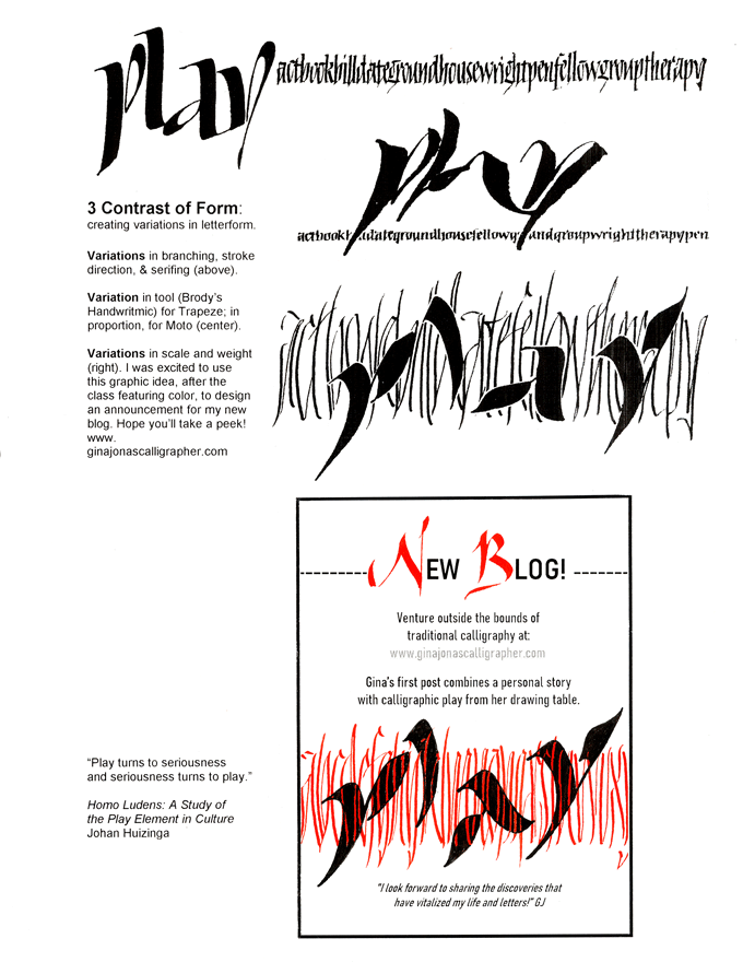
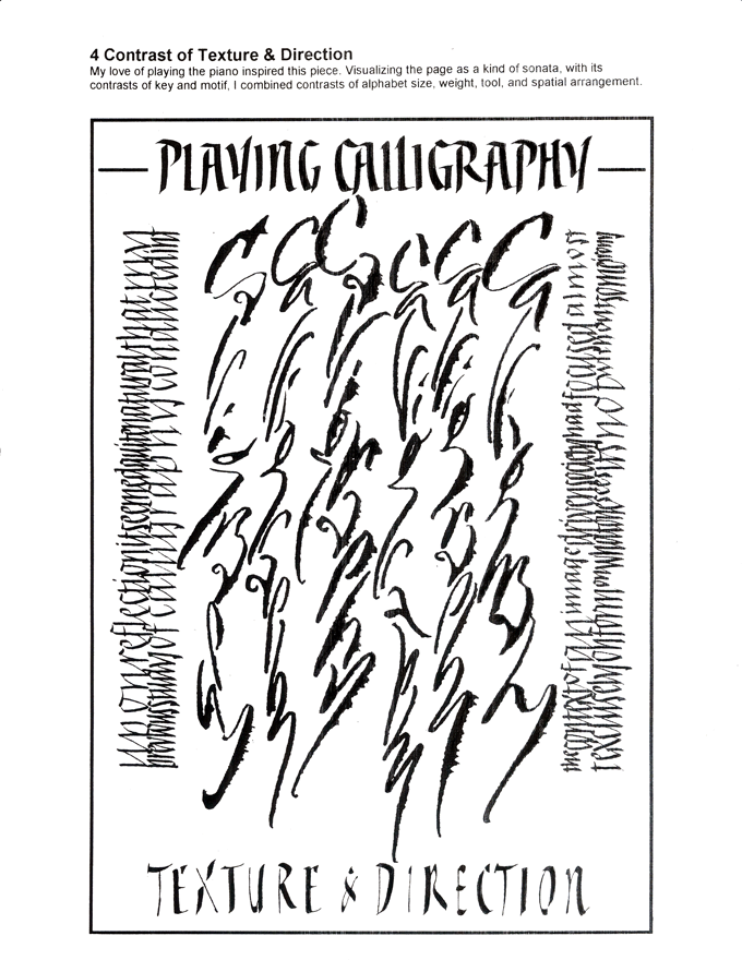
“Play – by Design!” which describes a recent calligraphic adventure (right column).
In the left column, I’ll briefly recount how I chose “play”
for my website’s new homepage and headers.
For Gina’s first post, click here.
To be notified of Gina's next blog post, please click “Contact” on the menu above.
![]()
Calligraphy as a play of
meaning, movement,
energy, rhythm, & feeling
Background. The desire to redesign my website’s homepage and headers came as a complete surprise. A little history. In 2006, my ongoing effort to survive in the computer age prompted me to create a website. Although its original purpose no longer applied, when I retired in 2012, I felt a responsibility to provide referrals along with a desire to share the record of my 41-year career. But retirement, it turned out, was in name only. I now dedicated myself fulltime to articulating the discoveries that had vitalized my life and letters.
Six years later, in 2018, I published my ideas in Calligraphy as Art and Meditation: A New Approach. To introduce it, I revamped my website’s homepage and headers to feature the book, a lengthy overview of it, and new classes and programs showcasing my non-traditional approach. But it’s now 2020, the year of the pandemic, and my eagerly awaited classes have been cancelled.
With momentum stalled, I heeded a friend’s advice, “There’s this great graphic designer—you should contact him about your website!” Complacency vanished as I absorbed the shock of his questions: “If your purpose is to feature the book, does the stamp-sized cover image on your homepage ‘read’ as a book?! Does it entice a guest to click further?” With these queries, I also realized that the narrow desire to promote my book had expanded and intensified: it had become a passion to promote calligraphy itself, the field that had inspired me to write my book.
Why not play?! Martinu, my newly-hired designer, advised me to create a focal point using a single word, one that would “irresistibly” draw a viewer’s attention. Why not “play”? Indeed, the play-spirit imbues my approach to calligraphy, and the word’s ascender and descenders offered dramatic possibilities. By using the construct “play of” in the homepage title, I could interweave calligraphy’s vital aesthetic facets—movement, energy, rhythm, and feeling—with its distinctive feature: verbal meaning.
To the charge “play” seems a frivolous choice during the time of a pandemic, I say, not at all!
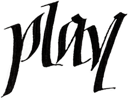 stimulates creativity and joy,
experiences that support
resilience, courage,
and confidence.
Through play,
we dive into the
wellsprings of intuition,
imagination, and spontaneity.
Play invites us to explore, to try-out new possibilities. It generates energy. Absorbing oneself in play galvanizes one’s attention and activates the little gray cells.
Pep talk. I wholeheartedly encourage you to seek out opportunities to play. There are plenty of safe ones, such as the exercises presented in my book: Calligraphy as Art and Meditation: A New Approach. (Publications) While adults may not enter this sphere as readily as children, it’s just as vital to them. Encountering self-talk—“you have better things to do”…”I’m not creative”— is a chance to break free of our “mind- forged manacles.” (William Blake)

Let’s choose an approach to life and letters that offers a foundation for inquiry and discovery. Let’s make it broad enough to encompass ourselves, others, and the world around us. At play, we make the discoveries that become our teachers, that help develop self-confidence.
Testimonial:
Through play, what my husband called “doodling,” I climbed to higher levels of skill, sophistication, and confidence in my creative ability.
Give yourself permission! Scuffed egos might be part of the process. But like scuffed knees, a little care and attention, perhaps some deep breaths, and the adventure continues!
Next post: “Notes on a Play Theory and Practice of Calligraphy” in which I’ll distinguish between conventional and play-based calligraphic practice, and argue that the spirit of practice is as important as the content.

The line images below were created for my class “Fabulous Filigree: Feeling the Flow.” Its purpose is to give students a fun way to sensitize hand, arm, and eye to the moving line: to both regular rhythmic patterns and a freer, more gestural line.
For this class we entwine two traditions: Western alphabetic writing and the decorative medieval linework I call “filigree.” As seen in a manuscript facsimile and my drawings below, the space around the enlarged, initial letters, known as versals, proved an irresistible playground for scribes and illuminators.
As we enjoy new horizons for play in our manuscript heritage, we may also explore the fundamentals of letter making as movement, energy, rhythm, feeling, and meaning.


