Welcome!
Please join me for a journey outside the bounds of traditional calligraphic practice.
The left column offers a personal history: an illustrated intertwining of life and art;
the right, a captioned "drawing table" of calligraphic development.
I look forward to sharing discoveries that have vitalized my life and letters!
A calligrapher is born—
and born again!
A tale of calligraphic destiny begins in Portland, Oregon. Due to the passion of Professor Lloyd Reynolds of Reed College, Portland became a hotbed for calligraphy in the 1960s. Enthusiasm spread as Reynolds taught the Italic hand to school teachers in summer programs. Inspired by such a course, my seventh-grade teacher, introduced us to pen, ink, and calligraphic letterforms.
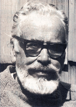
In high school, I had the good fortune to study with Reynolds himself, when my mother enrolled me for one of his evening classes. Along with his mission to bring Roman letters to life—prizing the “spirit as much as the letter”—we eagerly imbibed his passion for such Eastern aesthetic values as life movement and vital rhythm.
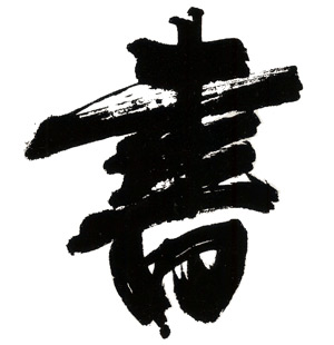
Wang Wen (1497-1576)
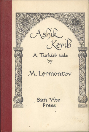
Not surprisingly, the University of Washington, which I attended in the late 60s, did not offer calligraphy classes. Had a chance meeting not occurred, the only sign of my calligraphic future might have been the Italic letters doodled in my notebook margins. While browsing in the notorious Id Bookstore (displaying pages from the Kama Sutra in its front window), I spied section titles written in Italic calligraphy. Upon learning that Steve Herold was both the calligrapher and the shop owner, I excitedly introduced myself. To my amazement, Steve had been a student of Lloyd Reynolds at Reed. Auspiciously, this led to my first commission: writing out a Turkish tale from an old British journal, which Steve published as a little book on his San Vito Press.
In 1970, just after receiving my BA in Psychology, the job market crashed. It seemed a good time to head east to Boston for an adventure and whatever job I could find. As it turned out, the only positions I found, waitress and clerk-typist, offered neither respect nor promise. Returning to Seattle to chart a course and desperate for income, I finally took a waitress job at a café two bus rides from my rooming house. Finishing my shift, the owner accused me of stealing $5.00 and, as if struck by lightning, I QUIT! I now knew in every fiber I had to find an independent means of livelihood. Recalling my early interest in calligraphy, I used rudimentary skills to create a sample portfolio. The time was right: I found work and I studied. Steve Herold became my mentor and, giving generously of his books and knowledge, helped launch me into a forty-one-year career.
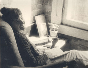
As a professional calligrapher, I found it deeply gratifying to create pieces for appreciative individuals, organizations, and institutions. And, although freelance calligraphy satisfied my obsession with financial independence, at the back of my mind always lurked the question:
the lottery,
would I continue
doing calligraphy?”
As the computer age unfolded in the mid-1990s, my livelihood felt threatened. After twenty-five years as a competent practitioner, spurred by fear rather than rational thinking, I decided my best chance of professional survival was to become a truly topflight calligrapher. To achieve this aim, I strived to emulate the work of contemporary masters. Through careful study, I discerned their letters were not only uncommonly well-made, but full of life.
a life pulse!
Having detected it, I could test for its presence: a “Yes!” to the question, “Do I want to look at it before I read it?” But assuming I could learn to make “living letterforms,” would this ability ensure survival as a calligrapher? With no way of knowing, but fueled by a passion to find out, I embarked on my journey.
Through a quest spanning many years, I sought the essential ingredients of living letterform. Every morning, before taking up commissioned work, I went exploring—“doodling,” my husband called it. Seeking answers from the masters themselves, I traveled the country, To my chagrin, experts only taught letterform, not sources for enlivening them. Slowly, however, my efforts yielded the graphic qualities of movement, energy, rhythm, and feeling. Gradually, I developed methods for infusing my strokes and characters with them.

Please see Gallery for more examples
Upon reflection, it seemed quite natural that my previous study of calligraphy, conducted in the context of an image-driven society, had focused almost exclusively on form: on what one sees. It’s not without some irony, then, that this eye-dominant approach blinds the student to the “elephant in the room”: the fact that the eye does not hold the tool!
Which, I now saw, made my body an important player. Not only the hand, which held the tool, but wrist, arm, and shoulder—all connected to the movement and energy of my body’s core. Like a dancer gesturing, or a musician sounding a note, the body must participate, fully and consciously, in the moment-by-moment act of stroke making. An awakened sense of touch intensified my awareness of movement and opened me to its potential for expressing feeling. A new immediacy enlivened my consciousness, animating me as well as my forms! These discoveries improved my calligraphy and, I believe, extended my survival as a calligrapher by many years. Unexpectedly, however, my passion for independent survival was transformed into a passion for sharing my discoveries. As a “born-again” calligrapher, the question that had lurked, “Would I be a calligrapher if I won the lottery?” had vanished.
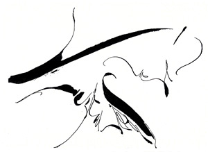
A new tool sparked this experiment.
In the next installment of this blog I hope to recount the adventure that led to approaching calligraphy as an embodied, holistic art.
The collages below feature “warming up” rather than finished pieces (which can be seen in Gallery). Why? For three reasons:
- First, because these examples exhibit the calligraphic qualities of energy, movement, rhythm, and feeling that infuse finished pieces with life and expressive power.
- Second, because I believe we can only develop these qualities by warming up before making letterform. We experience the physical, sensory act of writing and the pleasure of moving freely. A stiff, tense body is unlikely to create beautiful, vital letterform!
- Third, because warmups activate our whole self: mind, body, feeling, a sense of play and the imagination!
Warming up lets me get comfortable with the tool. It includes loosening up, stroke technique, and spontaneous experiments with letterform.
By using different pen sizes and papers “pictures” emerge of my mood and energy level—as answers to “What if I try this?”
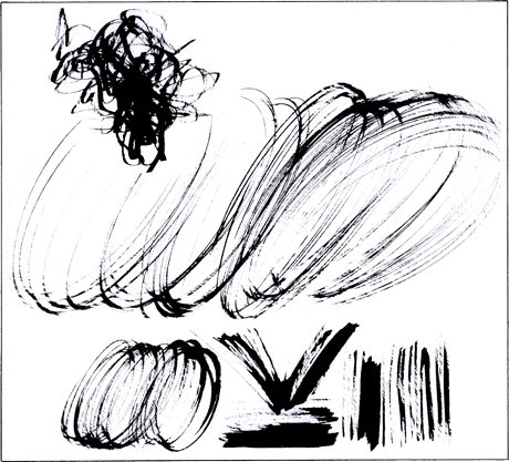
Loosening up.
- Top: A high-energy pen charges about (a bit manically!).
- Center: Large, energetic ovals connect mind (form) and body (shoulder power).
- Bottom: Working smaller, still quickly and vigorously, getting comfortable with the nib: curves, on its thin edge, and basic directional strokes—diagonal, horizontal, and vertical—on its full edge.
Technical note. The edged-pen’s nib consists of a thin edge, the thickness of the metal, and a full edge, its width measured from corner to corner (which can vary greatly). Variations in stroke width (thickness) result from two basic causes: the width of a nib and the direction it’s moved when held at a steady angle.
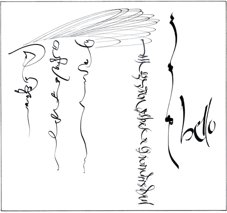
Combining warmup images to create a playful design.
- Top: Horizonal loops thrown on the nib’s thin-edge flat.
Continuing below, left to right:
- Three vertical squiggles with irregular rhythms.
- A single line of letter-like signs (but illegible)—called “asemic” writing.
- Using a larger nib, a pattern of short, horizontals and long, arced curves. Variation in stroke thickness reflects the changes in stroke direction.
- Trying to echo the thick-thin contrasts on these long arcs, I experimented with non-traditional letters to write the Italian word “bello.”
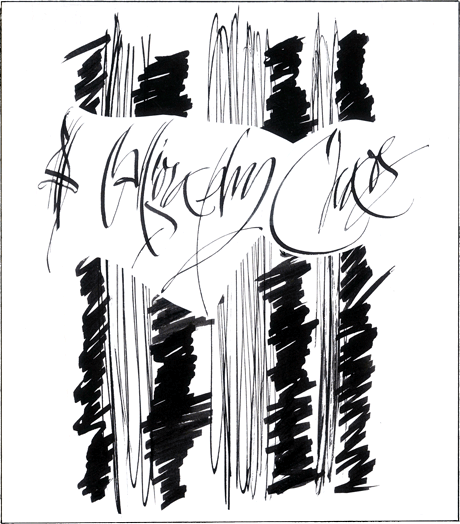
Shoulder limbering, plus.
- Long, vertical thin-edge throws (“thins”) and short, irregular horizontal full-edge zigzags (“thick”).
- Overlay: left, a thick-thin doodle preceded experiments with “calligraphy” and “chaos.”
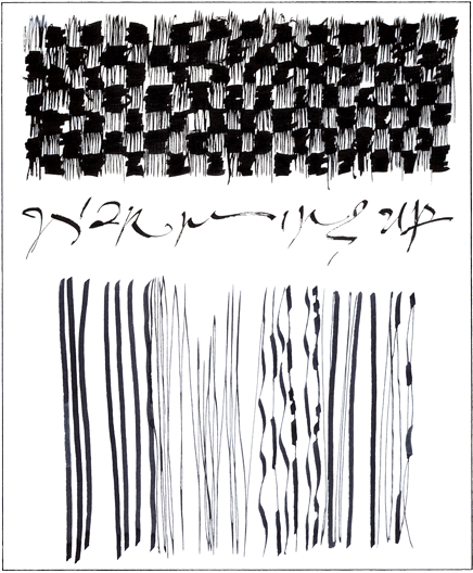
- A checkerboard of thicks and thins help develop tool dexterity for nib angle changes. The words “warming up” emerged afterward.
- Long lines: slowing down. Such exercises develop respective strengths: the fingers, for their sensitivity to the writing surface, the shoulder, as the primary source of contact pressure. Awakening the experience of “drag”—the relative resistance of thin and full-edge strokes—they promote rhythm and prepare you for refinement and expression in letterform. “Tuning up” and “playing” at the same time!
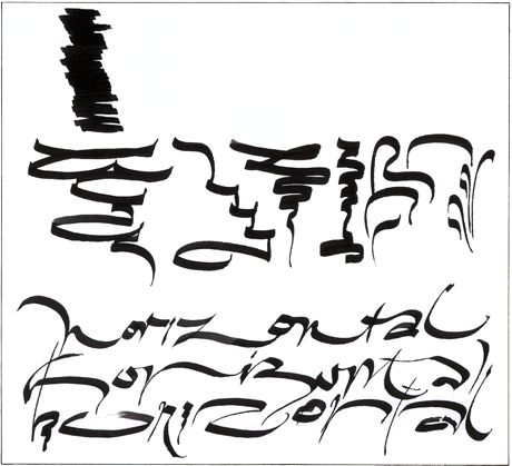
Exploring horizontal movement.
Although traditional Roman calligraphy emphasizes the vertical, a calligrapher at play investigates all directions for their felt and expressive potential.
- Top: Flooding the nib with ink to move freely on the full edge—where the nib meets its greatest resistance.
- Center: Freeform doodles emphasizing the horizontal.
- Bottom: Warming up gives confidence to experiment with calligraphic expression.
Note. Writing freely, without guidelines, encourages an exploration of the relationship between letters, words, and the lines of writing. Expanding her awareness of these text elements, the calligrapher becomes an impromptu letter/text designer, reveling in the “plasticity” of her art. Plasticity in a calligraphic context, refers to the “stretchable” quality of line and sculptural quality of two-dimensional space.
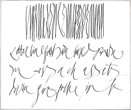
“Drawing” lines and letters.
The diminished “edge,” or drag, of a narrower nib, feeling more akin to drawing, may give the experience a “sketch-like” quality.
- Top: Long line doodling, alternating straights and curves. Long-lines keep the hand off the table and engage the power of the shoulder.
- Below: These three lines explore the plasticity of line and space in words.
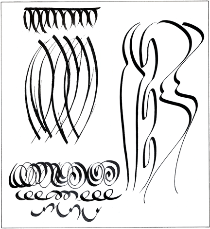
The gesture of curves.
- Top (left): Freely-made pointed “almond” hang from a long horizontal stroke.
- Below: The above shape is elongated and overlapped.
- Below: Curves overlap in circular loops and curl into spirals using counter-clockwise and clockwise motions.
- Right: Long strokes explore sensuous curvilinear rhythms.
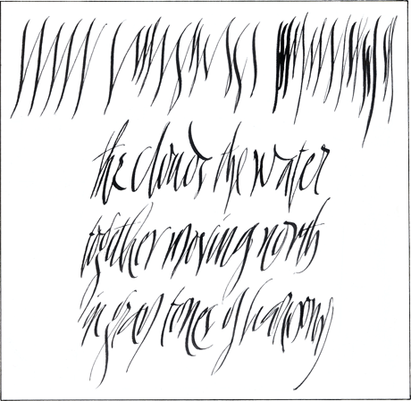
Reverse-curve tempos.
The reverse, or s-curve: two arcs facing in opposite directions, one atop the other. Seamlessly spliced, one appears to flow naturally into the other.
- Top: Left: a steady, even beat; and right, two syncopated versions.
- Bottom: Text keeps the sense of the above pulse with its accent on the downbeat.